list revision to data table
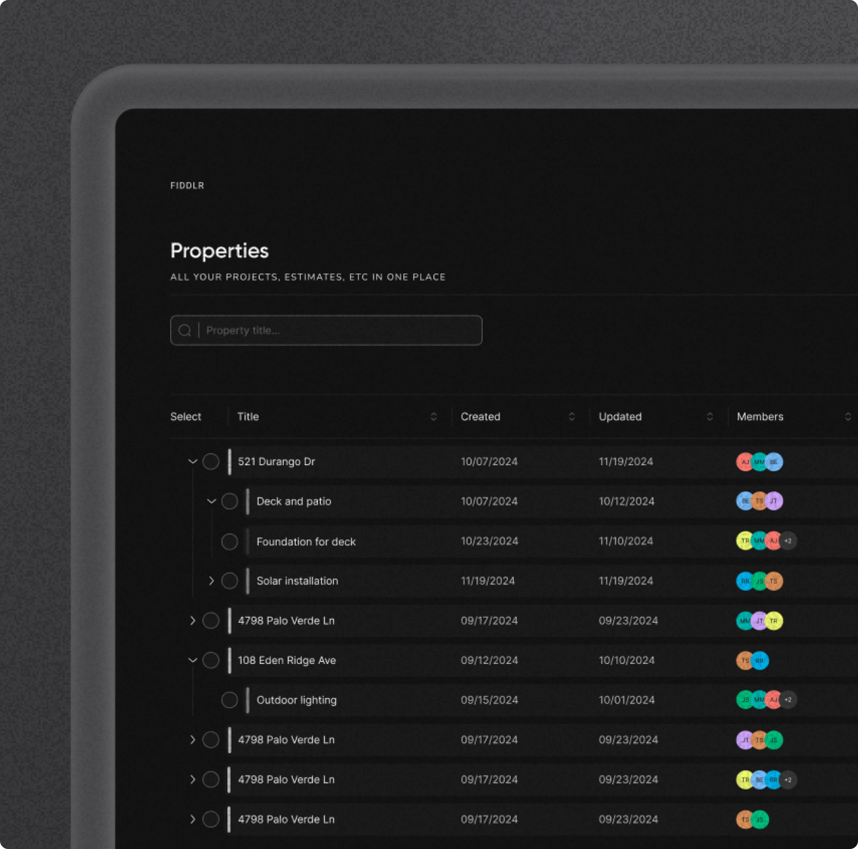
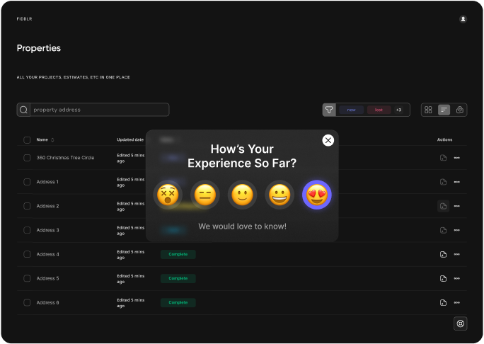
This case study shows how I transformed a basic list into a data table. The final design is clean, user-friendly, and efficiently handles large datasets.
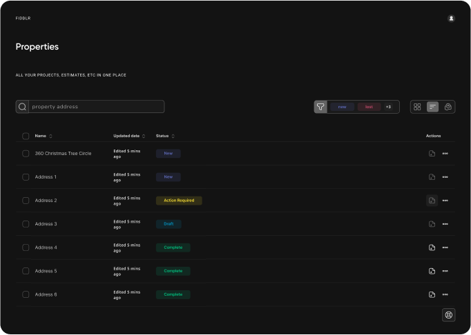
re-design the list
Initially, the list view no longer aligned with the project's direction
The list view needed additional features to better support the project's goals and improve the overall user experience.
my roles
- UX Researcher
- UX Designer
- Interaction Designer
why a redesign?
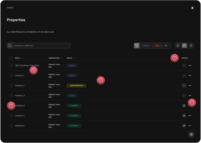
It was essential to closely analyze the pain points of the initial design
Through discussions with my team, we established a clear list of issues to address in the list redesign.
- Unable to nest rows
- Lacks customization
- Unable to sort
- No custom columns
- Unable to reorder
designing within constraints
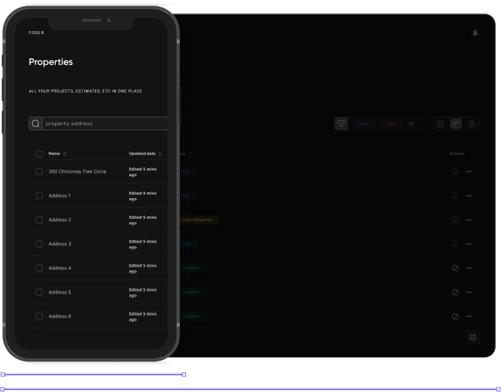
At the start of this task, there were certain constraints to consider
At this stage of the process, it was important to identify constraints to ensure the solutions would deliver the best possible results for the product.
- Must be visible on mobile devices
- Must be completed within 4 weeks
- Must accommodate users with low technical skills
- Users prefer minimal visual clutter
- Must be able to resize
success metrics
Before progressing further with this task, it was important to define what success would look like
During team meetings, we established specific success metrics to measure the effectiveness of this redesign.
Increased task efficiency
Time to complete tasks with the table improves by 25%
User satisfaction
Achieve a usability score of 4.5/5 or higher in post-test surveys
Adoption rate
75% of existing users adopt the new data table features within the first month of launch
let's talk about nesting
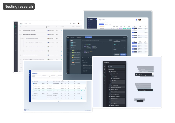
Nesting was challenging due to the need for clear data display, and the potential depth of some rows
Given the complexity of this case study, I found it most impactful to focus on just one of the key problems I solved.
nesting examples
I drew inspiration for nesting from various UI patterns across different elements
During my research, much of my inspiration came from the nesting used in file structures and task management systems.
getting ideas on the page
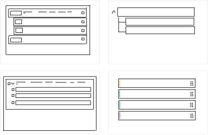
After gathering my research, I translated those ideas into sketches
With the potential solutions from research in mind, it was time to sketch out rough ideas tailored to this task and see what worked.
sketching workshop
Crazy 8s is a workshop technique where I sketch 8 different solutions in 8 minutes to quickly explore a variety of ideas
This exercise is great for overcoming mental design blocks and quickly generating a variety of helpful ideas in a short amount of time.
initial wireframe
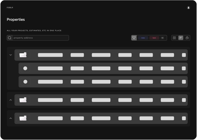
The first wireframe featured basic, nested rows
While this initial design was a simple and clean solution for nested rows, some adjustments were necessary. As the task evolved, it became clear that incorporating more elements of a traditional table structure would better align us with a comprehensive solution.
- I wonder how this design could look more lightweight?
- I wonder how it might look without the nesting containers?
- I wonder how to clearly illustrate columns in conjunction with the nesting
- I wonder how division lines between nested rows could look?
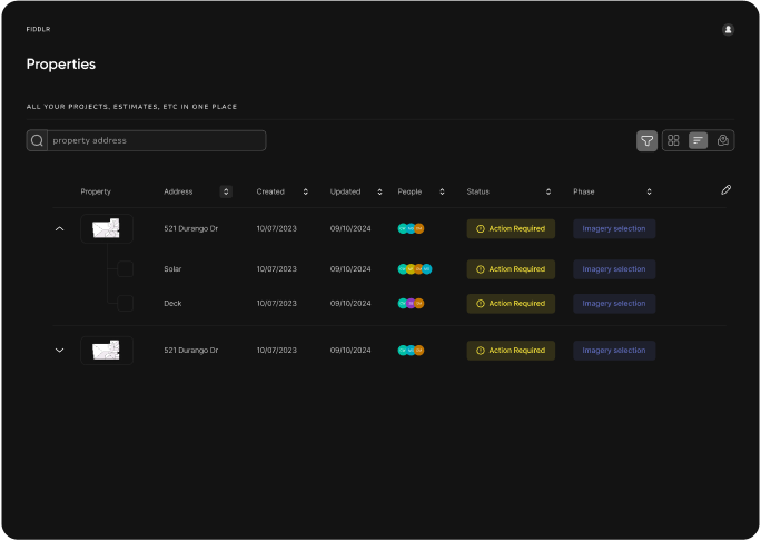
a more “table”-like feel
This frame combined clear nesting with a clean, readable design and added more typical table elements
I collaborated with my team to develop thought-provoking questions that would help refine and guide the design.
- What is the purpose of the thumbnail? Is it necessary?
- I wonder how the nesting could be adjusted to better accommodate multiple levels?
- I wonder how to clearly show nesting even on darker screens?
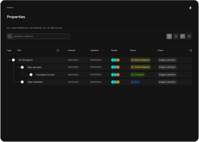
deeper nesting
This example demonstrates clearer nesting and a better use of available space
With the thumbnail removed and nesting clarity improved, this design offers a viable solution. The only potential issue is the use of space.
- How might this look with 3+ nested rows?
- On smaller screens how will the nesting illustration shrink down?
- What may take the place of the white circles next to the titles?
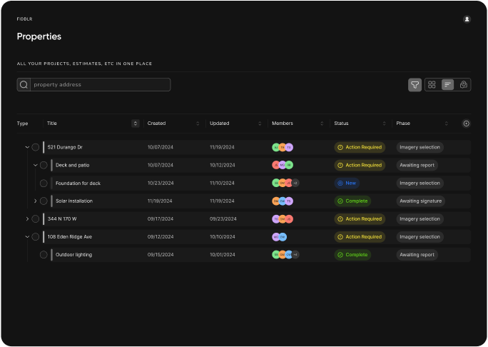
compact and efficient
This iteration improved nesting capabilities while maintaining a compact and clear design
This minimalist approach to nesting ensures that resizing the screen won’t disrupt the design.
- Clear hierarchy
- Compact design
- Resizable
- Selectable rows

nesting solution
The final solution resulted in a clean and elegant design
The new list features compact nesting, custom columns, selectable rows, and a clean layout that effectively displays complex data.
Increased task efficiency
Time to complete tasks with the table improved by 30%
User satisfaction
Achieve a usability score of 4.8/5 was achieved in post-test surveys
Adoption rate
95% of existing users adopt the new data table features within the first month of launch